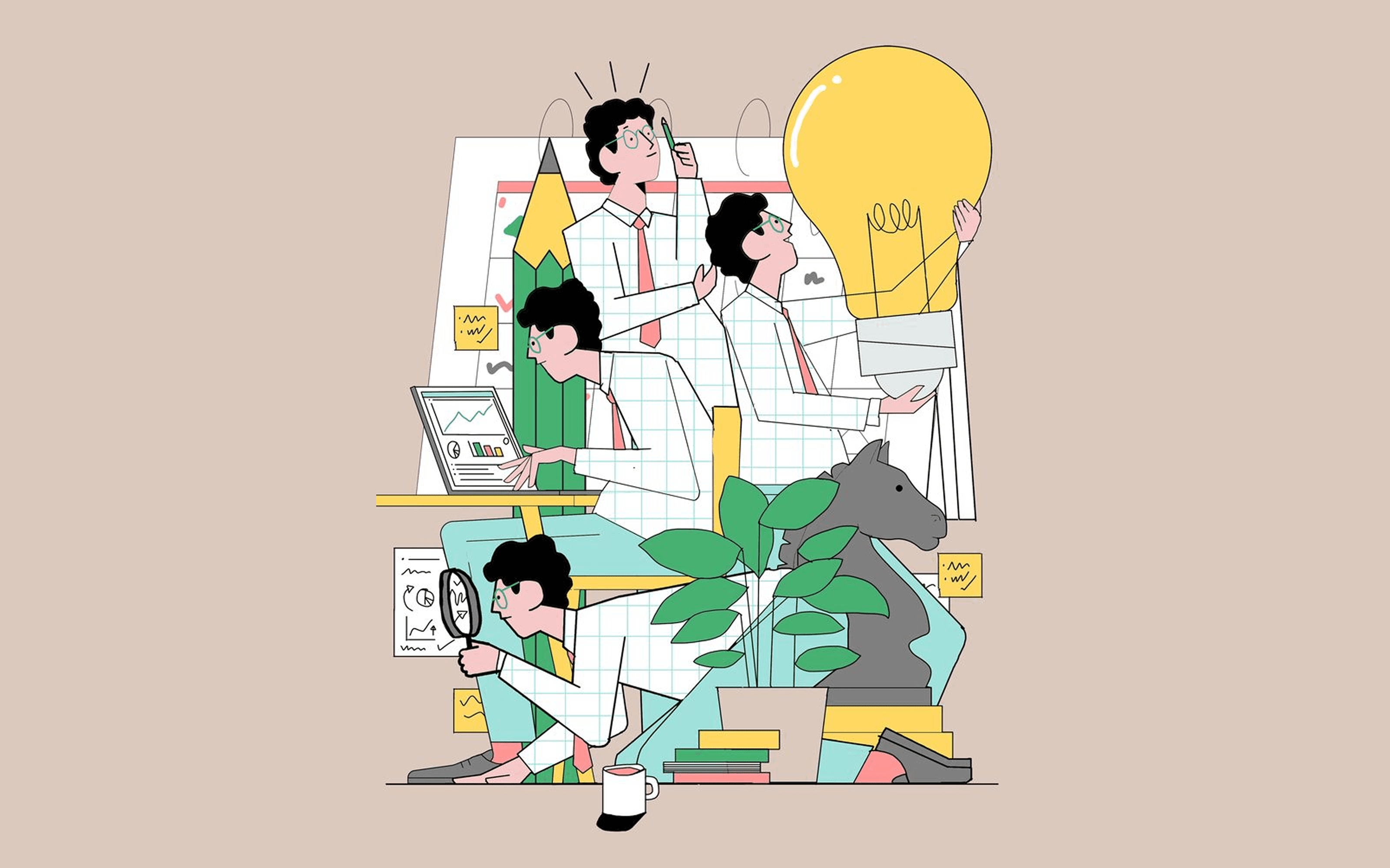
Designing for Users I Couldn't Meet
For two years, I designed a fintech platform for stock brokers, analysts, and risk managers. I never met a single user. All needs came through the founder.
Not ideal but here's how I made it work.
Turn every stakeholder chat into research. Before wireframing, I'd ask four questions: "Why do they need this?" (reveals the real goal), "What are they doing before this screen?" (reveals context), "What if they miss something?" (reveals priority), "How do they do this today?" (reveals the baseline).
Design two options when uncertain. Instead of guessing, I'd present two directions with clear trade-offs: "Option A is faster for power users but harder to learn. Option B is guided but adds clicks. Which fits our users?" This surfaced domain knowledge a single design wouldn't have provoked.
Study existing tools as proxy research. The founder showed me the Excel spreadsheets brokers actually used column headers revealed their mental model, manual formulas showed where errors happened, missing features showed what to build. I designed the digital platform to mirror their spreadsheet logic, just faster and error-free.
Sketch on paper before committing to Figma. Without user testing to validate, I needed to fail cheaply. Paper sketches take 10 minutes; a polished mockup takes 4 hours. I'd sketch 3-4 layouts, get a directional thumbs-up from the founder, then invest in high-fidelity.
The honest gap: Direct user observation would have caught usability friction I couldn't see. If I did this again, I'd push harder to join client demo calls from Day 1 even secondhand user contact beats pure proxy knowledge.
Perfect research conditions are rare at startups. The best designers make smart decisions with incomplete information and stay honest about the gaps.