BRAND IDENTITY & PACKAGING
Building Pawar Agro's identity from product to shelf.
COMPANY
Pawar Agro
ROLE
Brand Identity & Packaging Designer
EXPERTISE
Brand Identity, Packaging Systems, Art Direction, Brand Guidelines
YEAR
2025
Project Description
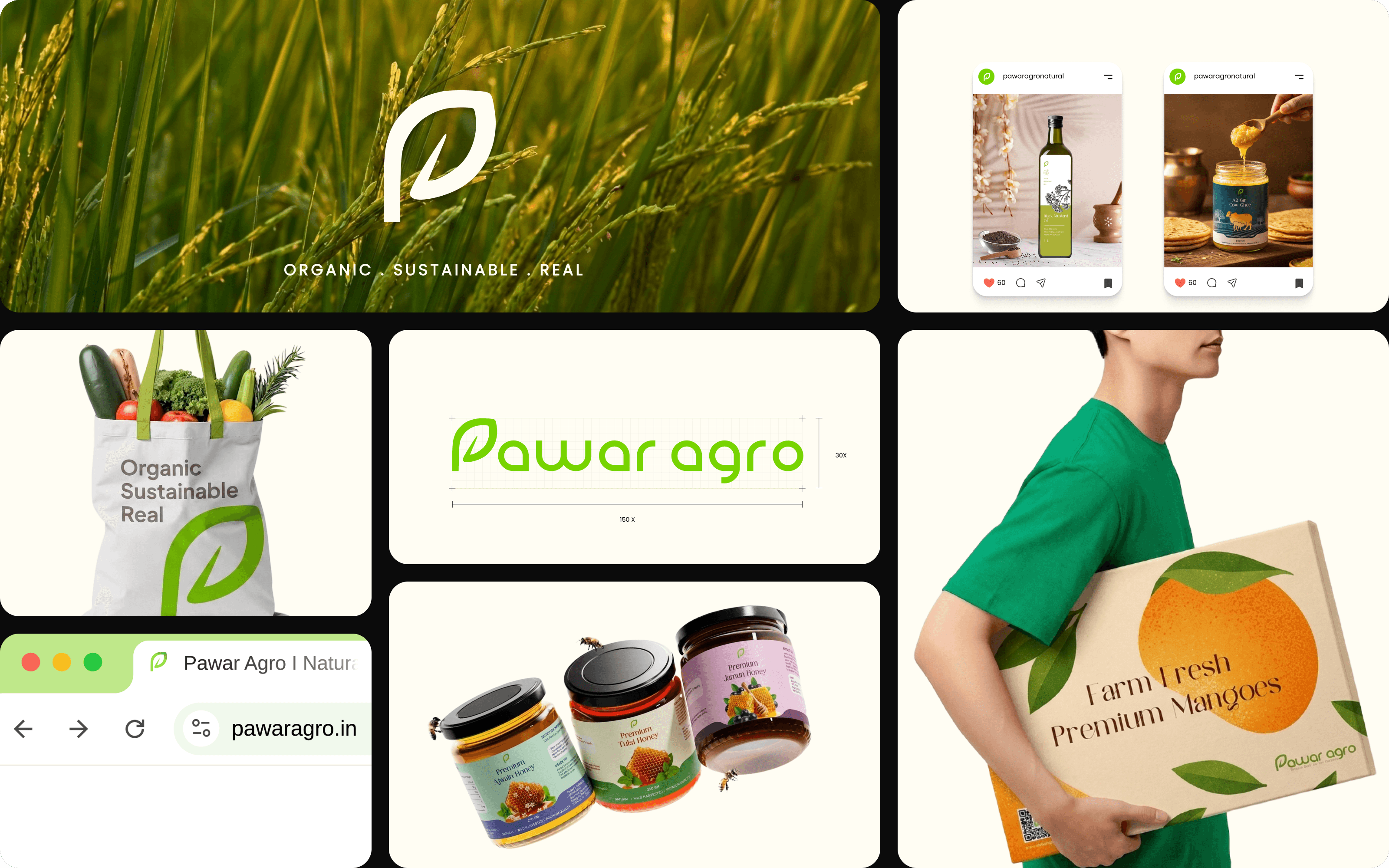
Pawar Agro is a natural foods brand from rural Maharashtra. Its products had strong provenance, but no consistent visual language. The products had a strong provenance but no consistent visual language.
I built the brand identity, packaging system and guidelines to create a recognisable language that could scale across 25+ SKUs, from digital touch-points to physical retail.
Challenge
Natural-food brands often rely on the same visual shorthand: kraft paper, hand-drawn leaves and earthy neutrals. Pawar Agro needed to feel natural without looking interchangeable and the identity also had to scale across 25+ SKUs, from a small product card to a physical retail stall.
My Role & Approach
I worked directly with the founder for eight months, leading the logo, visual identity, brand guidelines and packaging across the catalogue.
Process
Building one recognisable identity system that could scale across the catalogue.
Find the opportunity
Audit the category and identify the visual codes every brand was using to signal “natural.” The opportunity was to avoid those clichés and let provenance and product photography carry authenticity while the identity stayed quiet, modern and confident.
Build one recognisable system
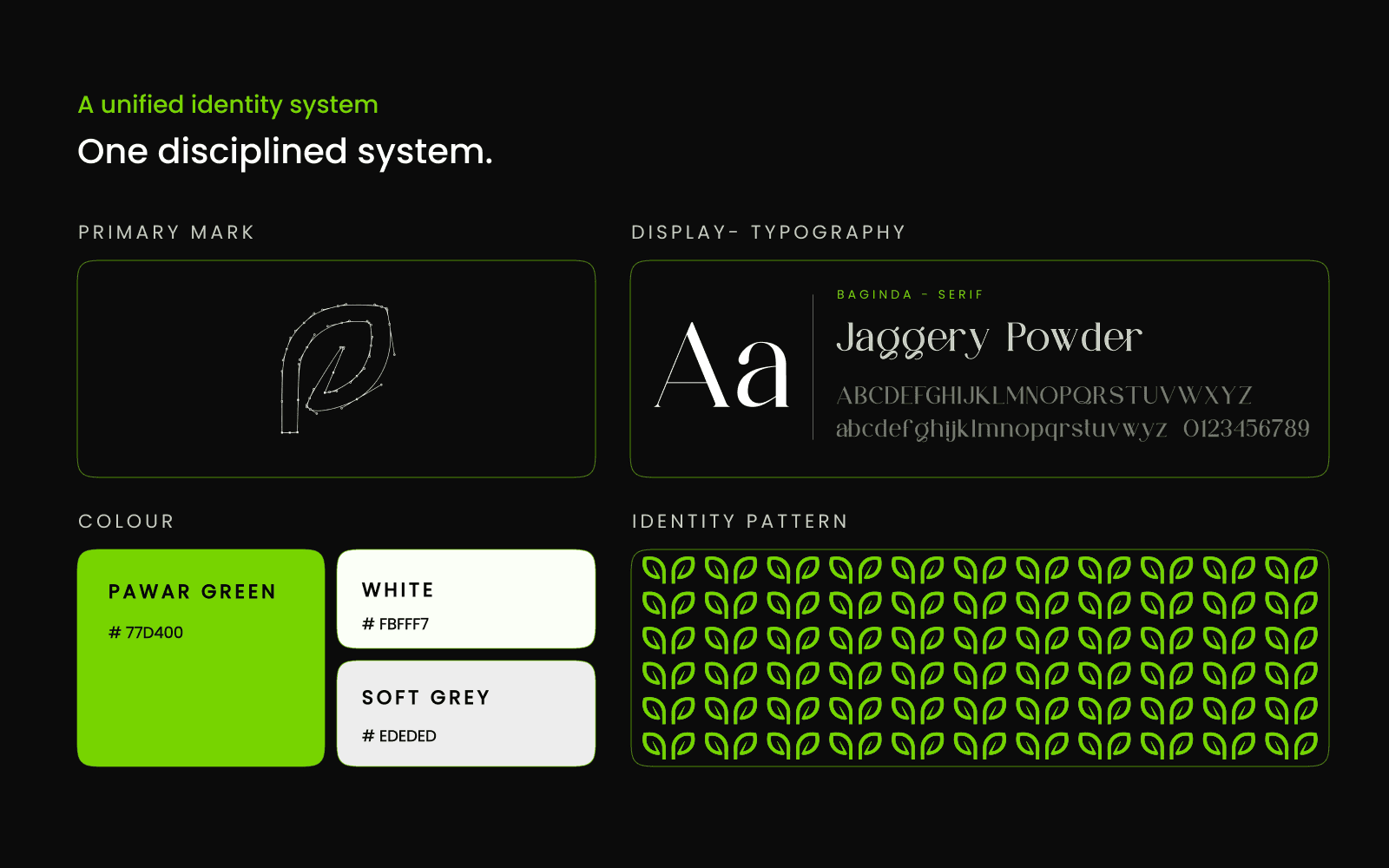
Create a dual-purpose mark, one ownable green, a repeatable leaf pattern and a restrained type system. The system had to remain recognisable even when the logo wasn't visible.
Scale it across the catalogue
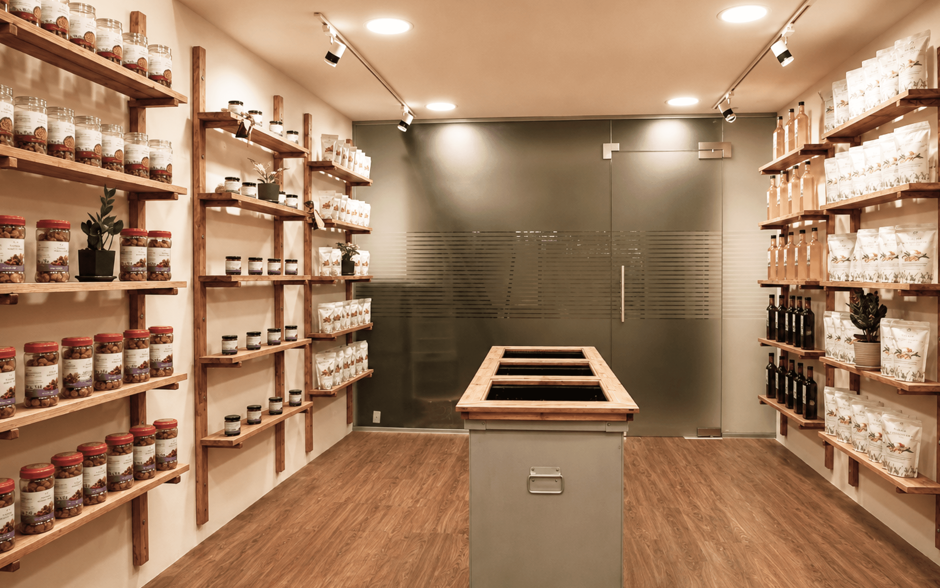
Translate the system into packaging templates, seals, shipping materials, digital touch-points and retail applications so new SKUs could be added without reinventing the identity for every new SKU.
Core Insight
The identity should be recognisable even when the logo is absent.
Design Principle
Let provenance and product photography carry authenticity while the identity stays quiet, modern and confident.
Solution
One identity system across mark, colour, pattern, packaging and guidelines.
A mark that does double duty
The leaf and the 'P' work as one compact symbol. The standalone mark works across favicons, seals and packaging tape, while the full lockup carries the brand name.
One distinctive green
A single high-energy green anchors the system. White and a soft neutral grey support it, keeping the palette distinctive without relying on the earthy codes common to the category.
The leaf pattern becomes the identity carrier
The mark expands into a repeatable pattern for shipping boxes, packing tape and backgrounds. This keeps the brand recognisable even when the logo is not visible.
Packaging across the catalogue
A consistent architecture adapts across different product formats. The packaging frames the food instead of competing with it, allowing product and provenance to remain the hero.
Brand guidelines as a working document
The handover included logo usage, colour tokens, typography, pattern application and packaging templates. The goal was to give the team a system they could continue using as the catalogue grew.

Outcomes
From identity to live catalogue in eight months.
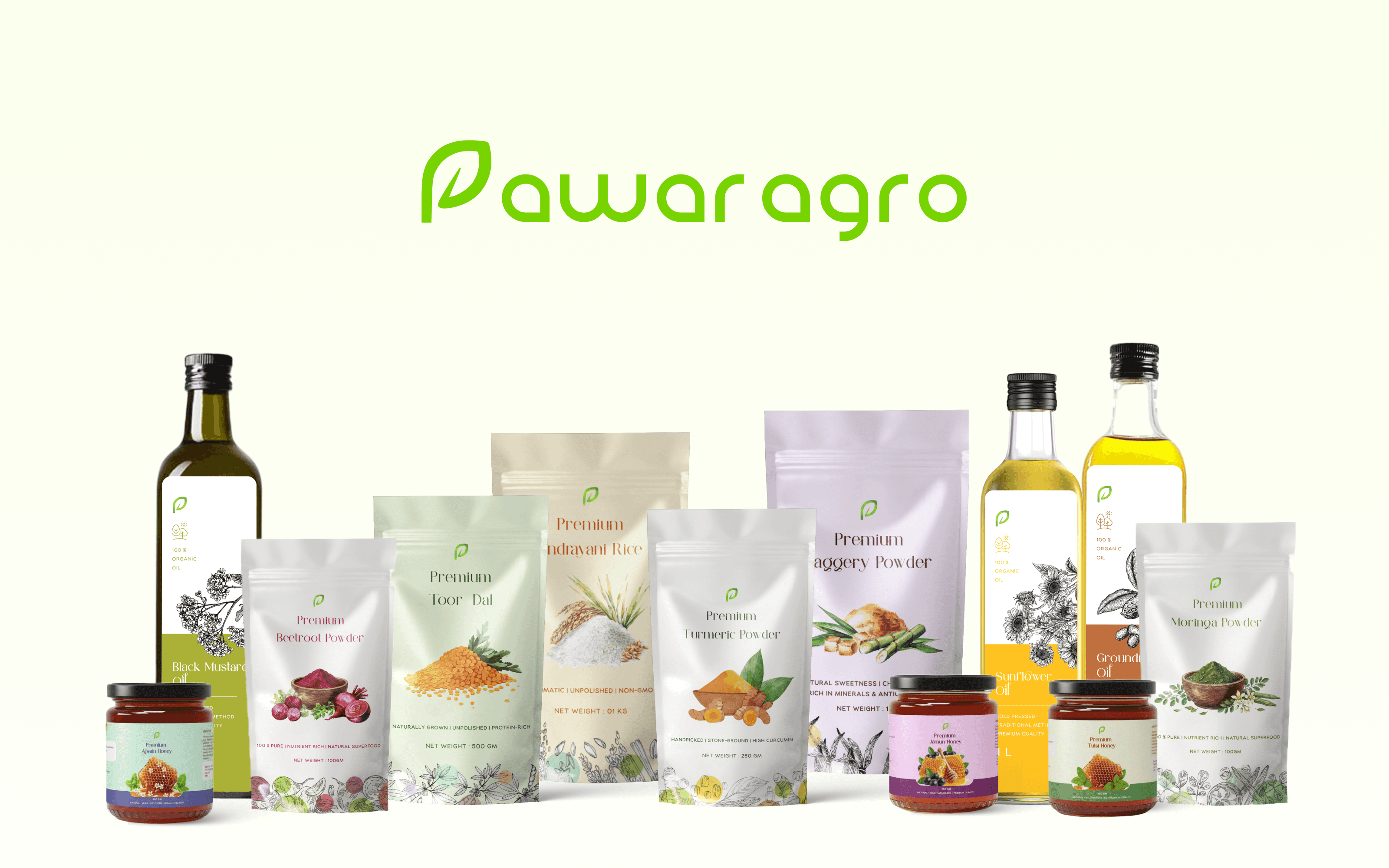
25+ SKUs
The identity and packaging system now works across the active product catalogue.
8-month working engagement
The system continued to evolve as new SKUs were added.
Bhimthadi Jatra Pune 2025
Pawar Agro exhibited the brand at the agricultural and entrepreneurship event.
Business Jatra 2026
Selected to exhibit at the business event.
Reflection
The real test of the system was whether new products could enter the catalogue without needing the designer in the room. For Pawar Agro, the system continues to be used as new SKUs are added.