BUILDING HIERARCHY INTO A FINTECH DASHBOARD
When showing everything means showing nothing
COMPANY
Confidential
ROLE
Product Designer
EXPERTISE
UX Research, Information Architecture
YEAR
2025

Building hierarchy into a fintech dashboard.
I designed the main dashboard for a B2B fintech platform used by stock brokers and portfolio managers. The challenge wasn't missing data. It was deciding what mattered first.
Challenge
Brokers start their day on the dashboard and return to it throughout the day. My V1 tried to answer everything at once: performance, market movement, trends and detailed data.
The client feedback was simple: there was too much information competing for attention.
That exposed the real question: What should a broker see first?
Process
From showing the right information in the wrong order to answering the right question first.
V1: Everything had the same visual weight.
The first version of the dashboard had everything on it: metric cards, charts and tables, all competing for attention. I thought I was being thorough by showing brokers every piece of information they might need.
But when everything is equally prominent, nothing is. The screen had no clear priority between what mattered first and what mattered later.
The feedback that broke V1
We showed the prototype to the client. The feedback was direct:
“There's too much information. We're looking at too many numbers and charts at the same level. We can't tell what to look at first."
The data wasn't wrong. The hierarchy was. The dashboard was behaving more like a report than a decision-making tool.
The assumption I had to throw out
I had assumed brokers would want to see what the market was doing first and what was moving, gaining or falling. That felt important when I was trying to understand the domain.
But when I spoke to brokers directly, I learned that the priority was actually inverted. They opened the dashboard to understand how their schemes were performing, and then how those schemes compared with the market.
Their question was, “How am I doing?” My V1 was answering, “What’s the market doing?”
The core insight
A dashboard is a sequence of questions answered in order.
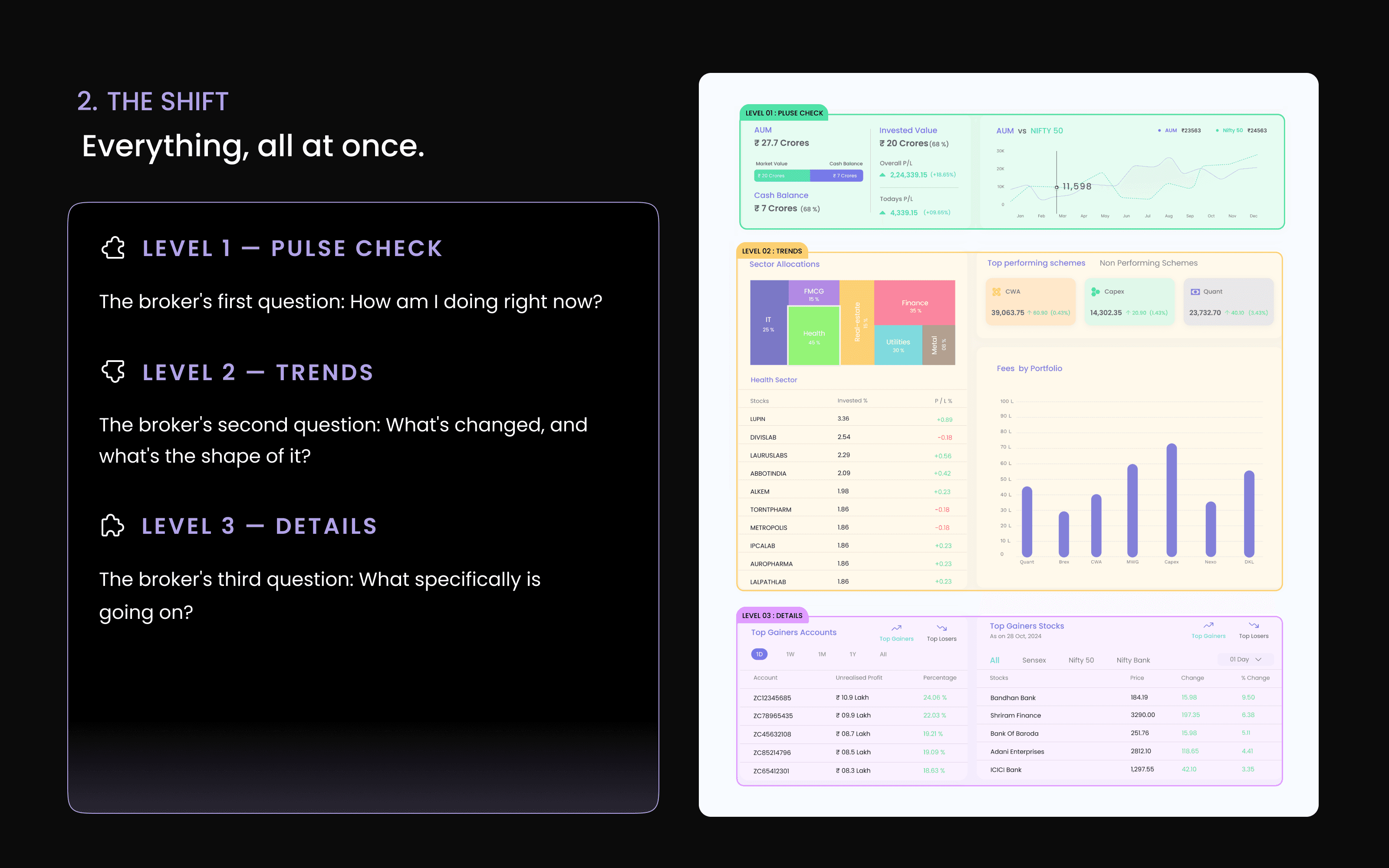
So I reorganised the dashboard around three levels:
Pulse check → Trends → Details
Design principle
Organise by depth of attention, not by completeness.
Users scan from top to bottom and go deeper only when they need to. The layout should support that scan, not fight it.
Solution
A three-level hierarchy that turned a flat dashboard into a decision-making surface.
Level 1 — Pulse check
Answers: How am I doing right now?
Key portfolio performance, AUM, and top-performing schemes come first.
Level 2 — Trends
Answers: What has changed?
Performance over time, allocation, and market comparisons provide context.
Level 3 — Details
Answers: What exactly is going on?
Positions, transactions, and client-level data are available deeper in the experience for investigation.
The iterations that got us there
V2 wasn't a one-shot solution. We iterated on what belonged in each level, using broker feedback to refine the hierarchy.
AUM moved up. Market trends moved down. Alerts were reprioritised. Things I initially considered Level 1 turned out to belong deeper in the experience.
Each iteration asked the same question: Does this help answer the current question, or is it demanding attention too early?


Impact

A dashboard that supported decisions instead of fighting them
Brokers could land on the dashboard and immediately see what mattered most without having to search for it.
Hierarchy as a working principle, not a layout choice
The hierarchy carried into other dense screens across the platform: risk dashboards, basket detail views, and client portfolio summaries. Hierarchy became a way to structure decisions, not just arrange content.
The lesson I carry forward
I assumed market data was the priority because I was looking at the platform from the outside. Brokers cared about their own performance because they were using it from the inside. The biggest lesson wasn't a UI pattern. It was learning to ask, “What question is this person actually here to answer?” before designing the screen.