DESIGNING FOR HIGH-STAKES UX
Stopping the wrong tooth from being selected
COMPANY
toothsi
ROLE
Product Designer
EXPERTISE
UX Research, UX/UI Design
YEAR
2023
Project description
toothsi plans clear-aligner treatments and relies on local partner dentists to carry out two irreversible chairside procedures: IPR (filing enamel between teeth to create space) and tooth extraction.
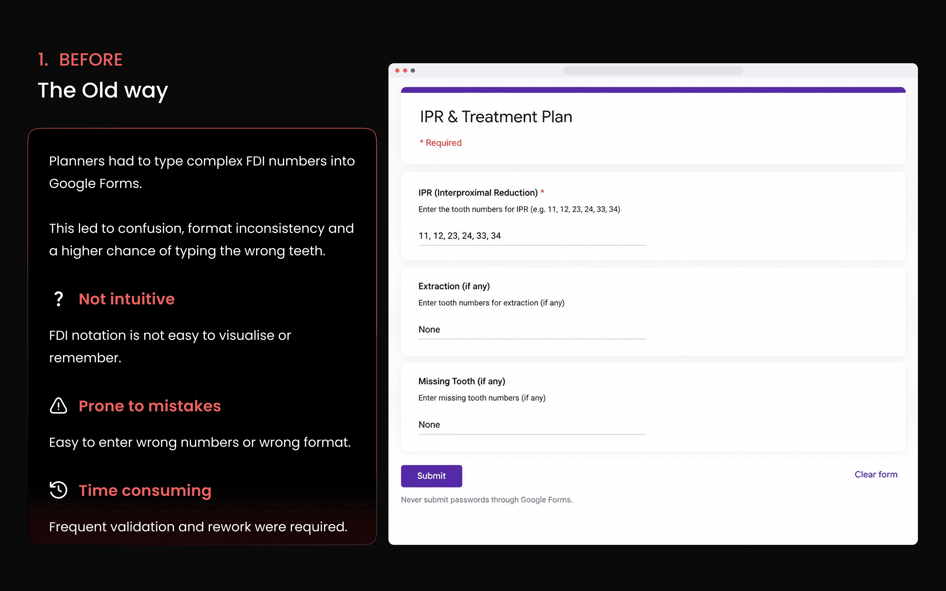
The instructions for these procedures were being sent to dentists through a filled-in Google Form a survey tool doing the job of a surgical worksheet.
I redesigned this workflow around how clinicians actually identify teeth, plan procedures and hand instructions to the clinic
Challenge
Tooth identity was entered as free text. A planner typed numbers such as 11, 12, 23 or 24. A typo such as 34 instead of 43 could look completely normal while pointing to an entirely different tooth.
When a number was mistyped or misread, the wrong tooth could be treated or extracted. The error then cascaded into rework, remanufactured aligners, repeat clinic visits, refunds and lost trust.
Ways of working
I led the research and design end-to-end, working closely with the planning team and partner dentists to understand where errors originated and where they became irreversible.
Process
Find the real failure, understand how clinicians think about it, then design the error out.
Map the end-to-end workflow
Mapped the flow from plan creation → instruction authoring → dentist hand-off → procedure → manufacturing. Reviewed past error cases to identify patterns and interviewed both the planners who authored the instructions and the dentists who executed them.
Find the real problem
The core issue was not carelessness. It was a representation problem. Clinicians think about teeth as positions in a mouth, not as two-digit numbers. The problem emerged when a spatial, anatomical decision was forced into an abstract text field.
Turn the clinical model into the interface
The design had to make the wrong input difficult to create while matching how clinicians actually think about teeth.
The core insight
This wasn't carelessness. It was a representation problem.
Design principles
Make the wrong input impossible, not just discouraged. Match the interface to how a clinician actually thinks about a tooth. Design for the dentist reading the instruction, not just the planner writing it.
Solution
A dedicated admin portal that replaced the Google Form across authoring, planning and the dentist hand-off.
Structured planning
Every case now lives in a traceable production system with UID, patient, plan type and explicit manufacturing instructions instead of scattered forms.
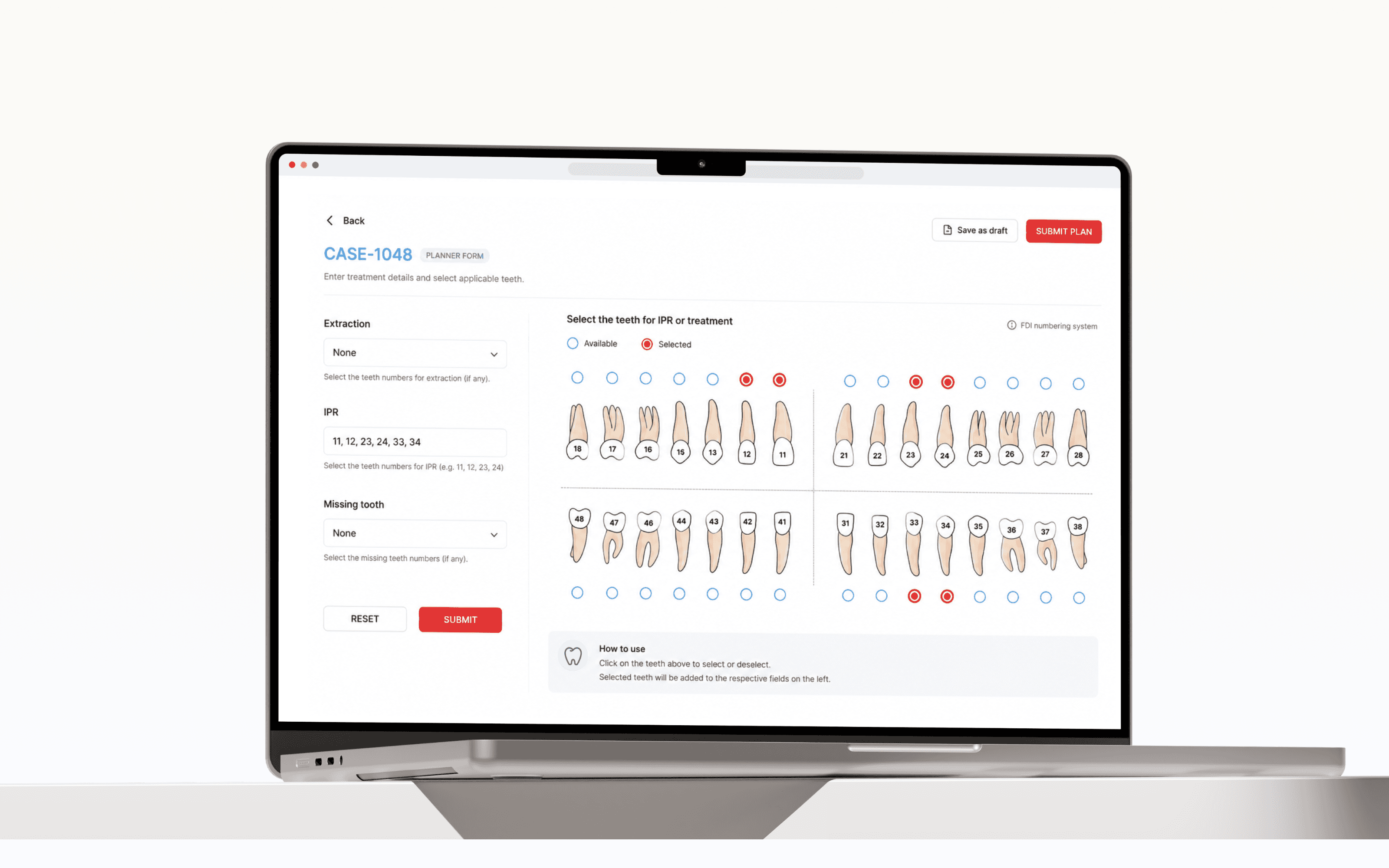
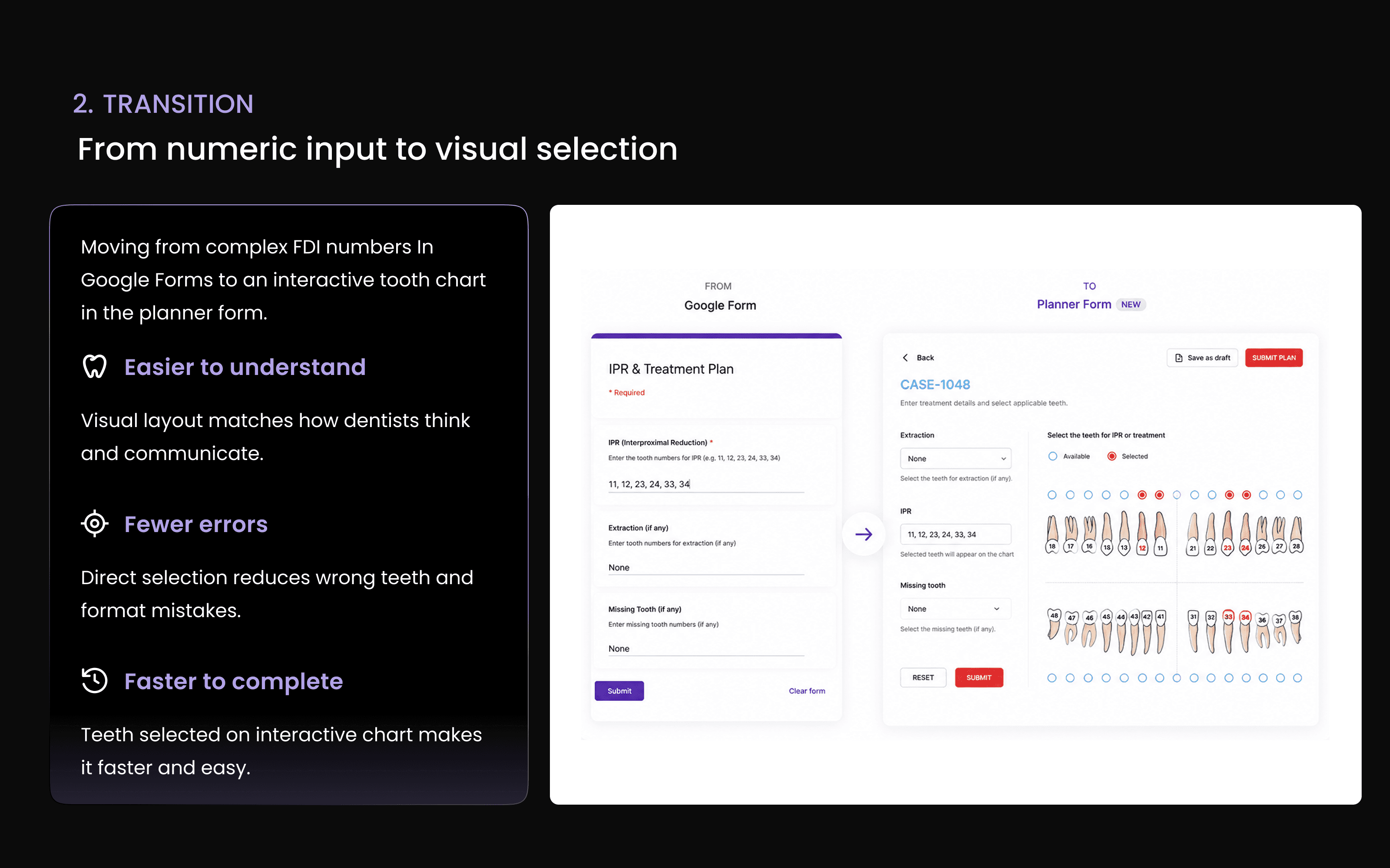
The fix: a visual tooth chart
To specify IPR or extraction, the planner selects the actual tooth on an anatomical FDI chart, laid out exactly as teeth sit in the mouth, instead of typing a number. You can't mistype a tooth that doesn't exist. The selection matches how clinicians think, and an incorrect choice looks visibly wrong in a way that 34 vs. 43 never does in a text field.
A medical-grade hand-off
The portal generates a structured instruction sheet for the dentist — designed to be read chairside, not as a survey printout.
Why this design decision matters
The interface does not merely validate the planner's input. It changes the representation of the decision itself, moving tooth selection from abstract text to a spatial clinical model.

Impact
The redesign addressed the primary source of wrong-tooth instructions by removing the opportunity for numeric entry errors.
Fewer wrong-tooth instructions
Removed the single largest source of error: mistyped or misread tooth numbers at the source, by making the tooth impossible to misspecify.
Less rework & re-manufacturing
Fewer erroneous cases meant fewer re-planned treatments, re-cut aligners and re-shipments, with fewer escalations, refunds and compensation events.
Protected timelines & trust
Patients stayed on schedule instead of restarting months-long plans, protecting the thing a healthcare brand can least afford to lose.